The Psychology of Color in Visual Media and Its Impact on Viewer Engagement
We are now living in a visually driven world, and the power of colors in capturing attention and evoking emotions cannot be underestimated. From the vibrant hues in a brand logo to the subtle tones in a movie scene, the psychology of color plays a significant role in shaping viewer engagement.
Understanding how colors impact our emotions and perceptions is crucial for businesses and different industries, as it can make the difference between capturing your target demographic’s attention or being overlooked. By understanding the psychological cues behind colors, brands can strategically use them to convey their message, build brand recognition, and foster an emotional connection with their audience.
In this article, I will walk you through the fascinating world of color psychology in visual media and guide you through exploring its impact on viewer engagement. Together, we shall uncover the secrets behind the colors that provoke emotions such as trust, excitement, and even hunger.
Whether you’re a marketer looking to enhance your brand’s visual identity or a filmmaker aiming to create a more immersive experience, this article will provide you with valuable insights on harnessing the power of colors to captivate your audience.
The Impact of Color on Human Emotions and Perception
As we generally understand, colors have a profound impact on human emotions and perception. Different hues can elicit a wide range of emotional responses, from joy and excitement to sadness and anger. Research has shown that color can influence not only our emotions but also our physiological reactions, such as heart rate and blood pressure.

For example, bright colors like red and yellow are often utilized in the food sector since they tend to boost heart rate and stimulate appetite. On the other hand, cool colors like blue and green are soothing and are often used in the wellness and healthcare sectors.
Furthermore, colors can affect how we perceive size and space. Dark hues provide the illusion of depth, whereas bright colors tend to make things appear closer. In today’s creator economy, where content creators want to influence viewers’ perceptions and provide them with a more immersive experience, this understanding could be very helpful.
The Importance of Emotional Connection in Marketing and Advertising
In the highly competitive world of marketing and advertising, establishing an emotional connection with the target audience is essential for success. However, emotional connections go beyond surface-level engagement and should create a lasting impact on viewers. By leveraging the psychology of color, brands can tap into the emotional responses associated with different hues, which could create a deeper connection.
Furthermore, colors have the power to evoke specific emotions and trigger memories. For example, warm colors like red and orange are often associated with excitement and energy, while cool colors like blue and green are linked to calmness and serenity. By strategically using colors that align with the desired emotional response, marketers can enhance their message and create a more memorable experience for viewers.
Emotional connections foster brand loyalty and drive customer engagement. When consumers feel emotionally connected to a brand, they are more likely to become repeat customers and advocates. By understanding the psychology of color and its impact on emotional responses, marketers can build a strong brand identity.
The Psychology of Color in Branding and Logo Design
Brands can leverage the psychology of color to create a strong visual identity and establish brand recognition. The colors used in branding and logo design play a crucial role in conveying the brand’s personality and evoking the desired emotional response from its intended audience.
For instance, eco-friendly firms use green to represent their dedication to the environment, while luxury brands often choose black and gold to communicate refinement and elegance. Marketers can successfully convey the brand’s message and create a stronger connection with customers by carefully choosing colors that complement the company’s values and target demographic.

Furthermore, consistency in color usage across different brand touch points is essential for building brand recognition. The consistent use of colors in marketing materials, packaging, and digital platforms helps consumers associate specific colors with a particular brand, making it easier to recall and recognize the brand in the future.
Applying the Psychology of Color to Website Design and User Experience
In the area of technology, color is essential for drawing users’ attention and directing their behavior when it comes to the user experience and website design. Designers can improve user interaction, boost engagement, and encourage desirable behaviors by deliberately using color.
One important consideration in website design is color contrast. High contrast between text and background colors improves readability and accessibility, ensuring that all users can easily consume the content. Similarly, using contrasting colors for call-to-action buttons helps draw attention and encourages users to take the desired action.
On any given website, colors can be utilized to arrange content and establish hierarchy. By utilizing various colors to differentiate between headings, subheadings, and body text, designers can catch the user’s eye and make it simpler for them to browse and understand the material.
Using Color in Social Media and Digital Marketing Campaigns
Because people’s attention spans are shorter than ever in the era of social media and digital marketing, it’s essential to grab the viewer’s interest right away. Colors can be a powerful tool for grabbing attention and creating scroll-stopping content.
Marketers should take into account color psychology and platform design when developing social media and digital marketing initiatives. Because various platforms have distinct color schemes and styles, content can have a greater effect if it is adjusted to fit the platform.
In an ecommerce site, colors can be used strategically to evoke specific emotions and drive desired actions. For example, using red in a limited-time offer can create a sense of urgency and encourage viewers to take immediate action, i.e., impulse buying. Similarly, using green in a call-to-action button can evoke trust and increase click-through rates.
It is important to note that consistency in color usage across different marketing channels helps reinforce the brand’s visual identity and increase brand recognition. By using consistent colors in social media posts, website banners, and email campaigns, marketers can create a cohesive brand experience that fosters a stronger emotional connection.
Case Studies: Successful Examples of Using Color to Create Emotional Connections
Brands, both big and small, have long recognized the power of color psychology and its potential to foster emotional connections. In this section, I will list a few compelling case studies that showcase how leading companies have successfully harnessed the psychology of color to create meaningful emotional bonds with their customers.
Coca-Cola: A Symphony of Vibrant Red
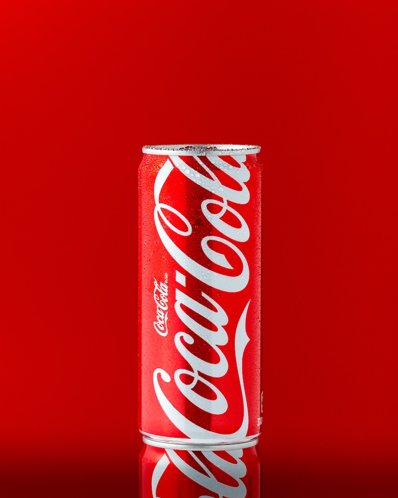
When you think of Coca-Cola, the first image that likely pops into your mind is that iconic red can. The beverage giant has been using this vibrant red color for decades, and it’s not by chance. Red is a color associated with excitement, happiness, and passion. It stimulates the senses and evokes strong emotions.

Every sip of Coca-Cola is imbued with the promise of joy and celebration. The brand has successfully intertwined the color red with its product, creating an indelible link between the two. Whether it’s a Coca-Cola commercial during the Super Bowl or the sight of a red can on a hot summer day, the emotional connection between the consumer and the brand is undeniable.
By adopting this bold color in their branding, Coca-Cola has masterfully crafted an emotional connection with its consumers.
McDonald’s: The Magic of Yellow and Red
Another brand that has skillfully harnessed the psychology of color is McDonald’s. The golden arches and the vibrant red background of their logo are instantly recognizable worldwide. But what’s the science behind this color choice?

Yellow and red are a dynamic duo when it comes to stimulating appetites and creating a sense of urgency. Yellow is associated with happiness and optimism, making customers feel welcome and comfortable, while red, as mentioned earlier, is linked to excitement and passion. When combined, these colors trigger a powerful emotional response that drives customers to crave those golden fries and juicy burgers.
Focus your attention on the colors surrounding you the next time you find yourself in a hurry to snag a fast meal at a McDonald’s. All aspects of the space, from the vibrant red chairs to the upbeat yellow interior, are strategically crafted to evoke specific emotions, thereby fortifying the client’s emotional attachment to the brand.
Apple: The Art of Minimalism
Although vibrant colors have the ability to evoke feelings of exhilaration and hunger, Apple has adopted a distinct strategy by embracing minimalism. The technology corporation’s decision to utilize a color scheme that is predominately white is crucial to their branding strategy, as it contributes to their well-known streamlined and minimalist design.

White symbolizes simplicity, elegance, and sophistication. Apple’s products and packaging are a testament to these values. When you unbox an Apple product, the pristine white packaging conveys a sense of purity and quality. The minimalist design language is consistent across their entire product range, from iPhones to MacBooks, fostering a sense of unity and identity.
The idea that Apple goods are extensions of a person’s lifestyle and personality, rather than just tools, is the foundation of the emotional connection the company has developed with its customers. With white being the brand’s primary color, it says a lot about its dedication to quality, innovation, and user-friendliness.
As visual media artists and marketers, understanding the impact of color psychology can be a game-changer in creating memorable and resonant brand experiences. By carefully selecting and strategically using colors, brands can establish a lasting and meaningful connection with their audience, ultimately contributing to their success in the market.
In your own ventures, whether you’re starting a small business or rebranding an existing one, consider the emotions you want to evoke in your audience and the colors that can help you achieve those connections. Remember, color is not just a visual choice; it’s a strategic one that can shape the way consumers perceive your brand and forge lasting emotional bonds.
